LD Staff Writer
Jumping into the world of graphic design can be confusing in the beginning. It can be even scarier when you are unfamiliar with common design terms! Knowing the language will help you communicate to any designers you work with, and help you understand their questions and concerns throughout the process.
The design of your dreams doesn’t have to be intimidating. Learn the terms to communicate like a pro!
Typography
Typography is type (or fonts) arranged to be readable and visually appealing. Usually, it will be designed in an artistic way that communicates ideas and concepts to the viewer. Many iconic logos are typography based. A few examples are Visa, MailChimp, and Calvin Klein.
Typeface (Type or Font)
The words typeface (type) and font have become interchangeable, and nowadays, they essentially they mean the same thing. If we’re getting technical, though, “typeface” is the name for an overall family, and “fonts” are individual members of a typeface family.
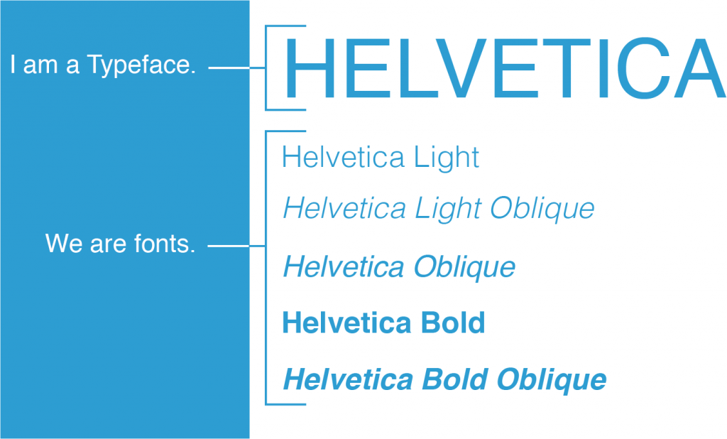

For example, helvetica is a typeface – but the styles of helvetica (helvetica light, helvetica bold, etc.) are fonts.
Explore more typefaces and fonts at FontsInUse!
Serif vs. Sans Serif

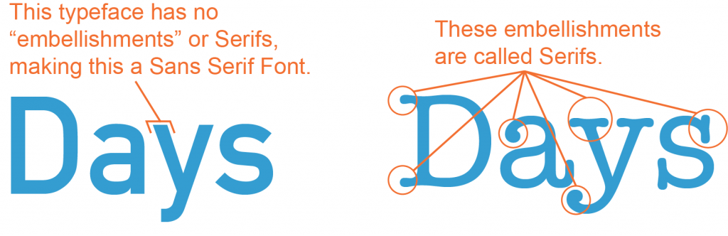
There are many different forms of typeface, but these are the two you will probably run into the most. A “Serifed” font has decoration at the ends of the letters. Those bits, as you may have guessed, are called Serifs. A “Sans Serif” font is one without those decorative bits – “Sans” meaning “without.” Sans Serif fonts often have no variation in the lines they’re made up of. The letters are the same thickness throughout.
Hierarchy
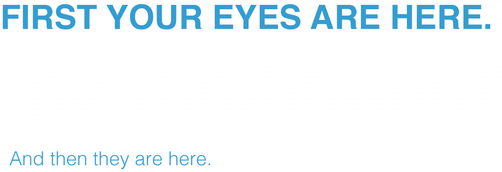

This is a system of grouping type so the reader can easily navigate the design or content. In this example, it is clear what the viewer is supposed to read first. The “flow” is plainly laid out. You read the bold text first, and your eyes naturally move to the lighter text next.
Body Copy
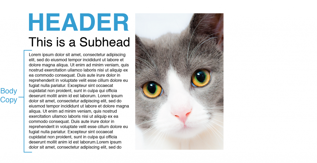

“Body copy” is the bulk of your document. Whether it’s an advertisement, magazine, or website, the body copy is separate from the headers, subheaders, and graphics. This adorable cat can be found here!
Palette
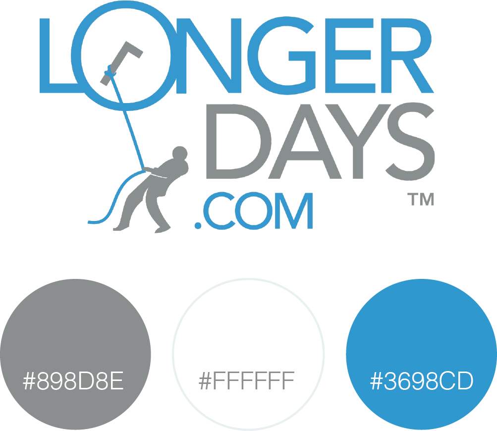

A palette consists of the colors you choose for your design. These are the colors we use for the LongerDays logo! If you don’t know what colors you’d like to use, try Coolors, a generator that creates a palette of colors that go well together. You can lock a color you like and generate palettes based on it.
CMYK
CMYK, or “Cyan, Magenta, Yellow, Key,” is a color model used for print purposes. CMYK is subtractive, which means that we begin with white and end up with black. So, as we add more color, the result becomes darker.
RGB
RGB, or “Red, Green, Blue,” is a color model that is used for on-screen purposes. RGB is additive, meaning that when mixing colors, we start with black and end up with white as more color is added.
White Space (or Negative Space)
This is the space surrounding the words and shapes in your design. Some designers choose to use the negative space to create an additional design. One of the most popular examples of this approach is the space between the E and the X in the FedEx logo… It creates an arrow!
Resolution
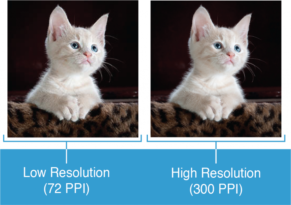

Resolution is the number of pixels in an image. The greater the resolution, the higher the quality. This is important for both print and web design… But especially for print! A low resolution image may look perfectly fine on a computer screen, but when printed, it is completely pixelated. For that reason, it is best to print images and designs 300 DPI or better.
*Side Note* You may hear the terms DPI or PPI when talking about resolution. DPI refers to the number of printed dots contained within one inch of a printed image. PPI refers to the number of pixels contained within one inch of an image displayed on a computer monitor. The image of this cute kitten can be found here!
Vector & Raster
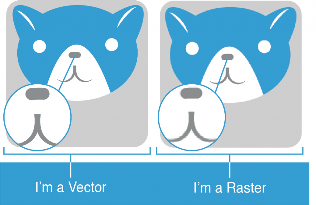

Vector graphics are created with vector software (like Adobe Illustrator), and are common for images that will be applied onto a physical product. They can be resized without any quality changes because they do not depend on pixels. When you zoom into a vector, it will always look the same!
Raster images, however, are created with pixel-based programs (like Adobe Photoshop), or captured with cameras or scanners. Raster images are composed of pixels – if you zoom in, you will eventually see tiny squares, no matter the resolution.
This rundown of common graphic design terms is just the beginning – design is a whole field of study after all – but with these under your belt, you’ll have a better idea of what to expect, how to discuss projects, and how to get the right materials in your designer’s hands.
A big part of achieving a great design is great communication – and now you know the language of the trade!
Want to learn more?
[su_button url=”https://longerdays.com/2018/01/01/take-a-tour-of-our-features/” target=”blank” style=”flat” background=”#2F6690″ size=”10″ center=”yes” radius=”6″]Take a tour of our features![/su_button]