LD Staff Writer
If a website is the face of a business, typefaces (fonts) are the facial expressions! They help to convey the message a business, organization, or person wants to send out into the world. Knowing how your chosen typefaces affect a reader can help you communicate with your target audience more clearly.
This is not an all-inclusive list, and there always exceptions to the rule… Instead, this is a beginner’s guide to navigating fonts, not an exhaustive list of laws you must follow.
Take everything with a grain of salt.
Serif
A serif is a small embellishment attached to a letter or stroke. Typefaces with such embellishments are called “serif fonts.”
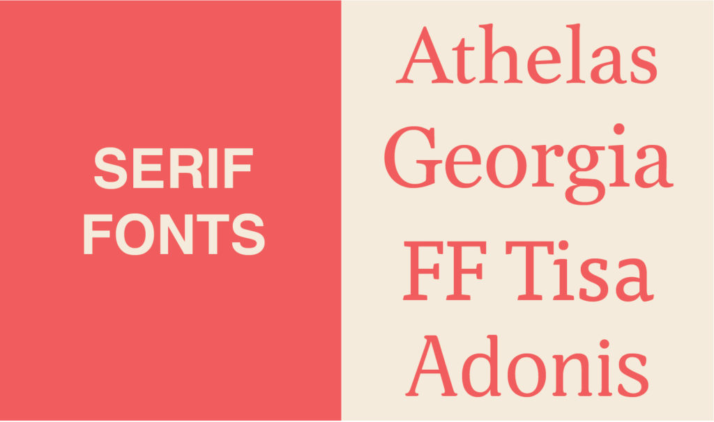
Best Uses:
If you’re looking for a professional and traditional feel to your design, serif fonts are the way to go! This type style is most commonly associated with newspapers, and is perfect for body text, headers, and logos.
Worst Uses:
Using a serif font in a piece of design meant to be playful may have the opposite effect. Try to avoid it!
Sans Serif
A “sans serif” font is one without those decorative bits – “sans” means “without.” Sans serif fonts often have no variation in the lines they’re made up of. Sans serif type became popular in advertisements during the Art Deco movement because of their streamlined and machine-made look.
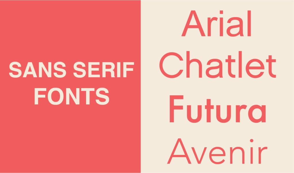
Best Uses:
Sans serif fonts are perfect for a modern design. This type is good for body text, headers, and logos.
Worst Uses:
Similar to serif fonts, there are very few wrong ways to use this font style, like when you want to convey a lighthearted message, conjure feelings of nostalgia or an “old timey” vibe, or any other situation where you wouldn’t use adjectives like “modern,” “minimal,” or “industrial.”
Script
Script typefaces are based upon the varied and often fluid stroke created by handwriting.
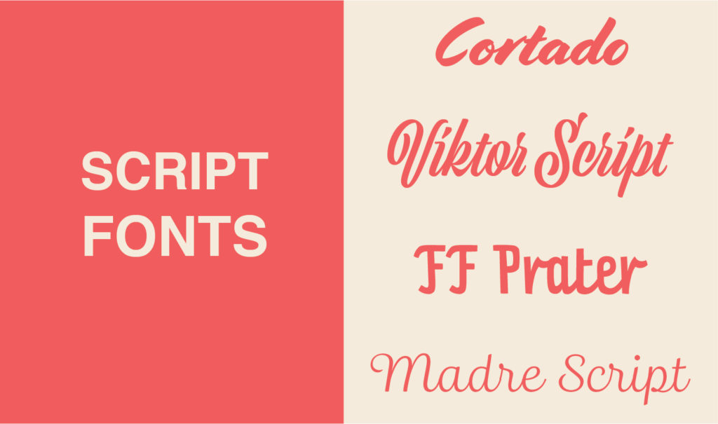
Best Uses:
Script fonts are perfect for conveying an elegant design. This type is great for things like wedding invitations and formal greetings!
Worst Uses:
Unless you are using a feather quill by candlelight to write your memoir, please don’t use script for body text! It can quickly become hard to read and visually crowded. It’s also important to note that script fonts should never be in all caps – and that only ONE script font should be used per design.
Monospace
Monospace fonts take up equal space for each letter. Typewriters and early computers used monospaced type. The hardware of the time did not accommodate the variable widths of other type families.
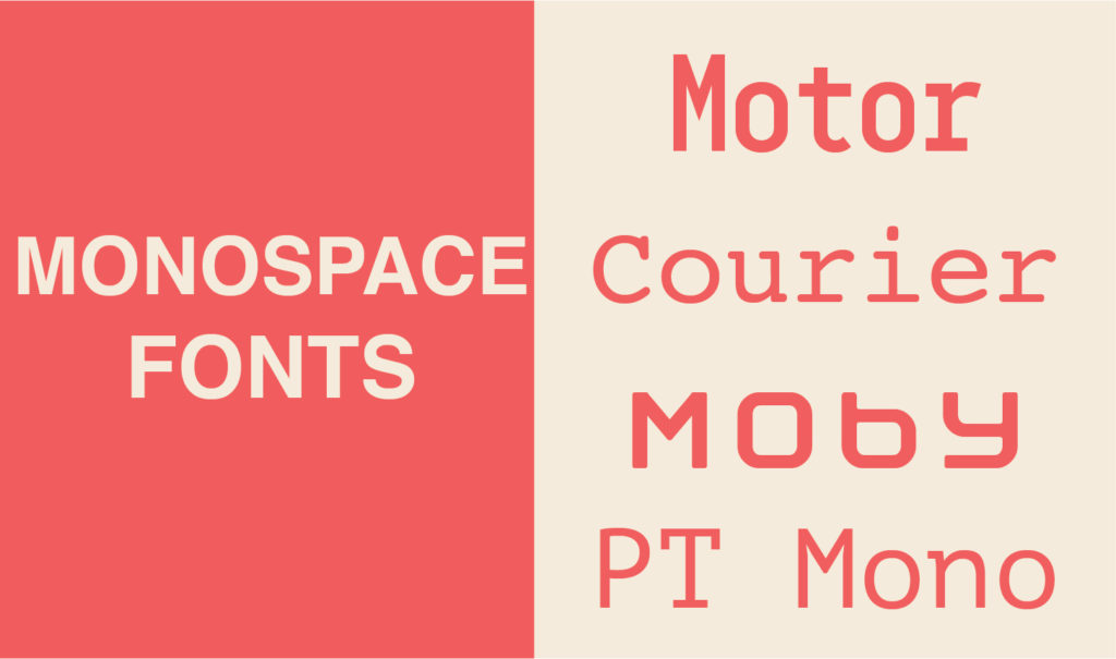
Best Uses:
This font type is most commonly used for HTML coding, or to give a “computer hacker” vibe.
Worst Uses:
Avoid using this font type for body text. Monospaced fonts take up more horizontal space, so you’ll always get fewer words per page. In certain instances, a monospace font can work well in body text, but it’s best to avoid a general rule.
Display (Decorative) Fonts
“Display fonts” is a blanket term for typefaces that don’t fit fully into any other categories. They are usually embellished and decorative.
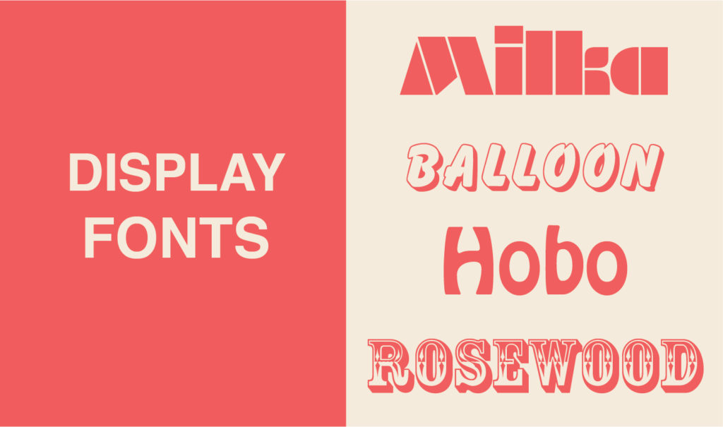
Best Uses:
Display Fonts are best for headers and sometimes logos. These are especially good for posters and other one-time designs. It is generally advised, though, to stay away from display fonts if possible.
Worst Uses:
Display fonts should NEVER be used for body text.
This general outline of font types should help you get a sense of what families work best in different scenarios, and provide some insight into why designers make the choices they do.
The better you understand some of these principles of design, the more you can participate in the process, the closer the designer’s ideas will align with the vision you present, and the more prepared you’ll be when it comes time to discuss the best look for your messaging.
It all adds up!
Want to learn more?
[su_button url=”https://longerdays.com/2018/01/01/take-a-tour-of-our-features/” target=”blank” style=”flat” background=”#2F6690″ size=”10″ center=”yes” radius=”6″]Take a tour of our features![/su_button]