LD Staff Writer
One of the single most important aspects of successfully marketing a business is creating and maintaining a professional brand image. How your business appears to the customer is just as important as the products or services you offer…
An image that appears established and professional – regardless of how long your business has actually been around – goes a long way toward earning your customers’ trust and confidence, which prompts them to explore what you offer in the first place. Your brand is your first impression.
Many startups don’t invest the money into developing their brand image because they either don’t understand the importance, or they think that they can’t afford it.
Thankfully, you don’t have to hire a super expensive design firm to help you create your brand image! There are all kinds of immensely talented freelancers in the world who would love to work with you, including those willing to work with your budget.
Investing in developing a professional brand image is just as important as your office space, your hosting provider, or anywhere else you need to invest money to successfully operate your business.
…But what constitutes a professional brand image, and how do you go about setting it up?
First, Your Logo
The single most important part of your brand is your logo. It’s going to appear pretty much everywhere you promote your business, but how do you design an effective one?
Your logo needs to communicate two messages: who you are and what you do. It also needs to achieve these two things in a very clear, simple, and unique manner – and stand out among your competitors.
You don’t want to design a logo composed of stock clipart and generic fonts from Microsoft Word… Such logos scream “low budget,” and do nothing to help you look like an established, reputable business that customers will easily trust. In fact, they send the opposite message.

This fictitious example illustrates the difference between using cartoony clipart and kitschy typefaces as opposed to clean, professional looking typefaces and simple, clean artwork.
Instead, you want a uniquely designed logo that can be easily adapted to different sizes, colors, orientations, and media formats.
This means that if you have a logo that uses several colors, you’ll also want a version in black and white… There will inevitably be applications where your full-color logo isn’t going to work.

Likewise, the proportions of your logo are hugely important. Because social media is such a huge part of our lives – and an increasingly important part of marketing a business – having a logo design that easily fits within the 1:1 square proportion of social media profile images is critical.
The look and feel of your logo depends a lot on the type of industry you’re in, as different industries tend to have different aesthetics. For example, if your business is about marketing wellness services to middle-aged women, you probably don’t want a logo that looks like it belongs to a heavy metal band.
There are also different ways to “structure” your logo, meaning the ways the symbol part of the logo and the typography of your business name integrate with each other to create your complete logo.
Some logos keep the symbol and the type separate, but are very specific about how the type and symbol are positioned relative to each other (these are called “lockups”). In these cases, you might want both a horizontally oriented logo (where the type is positioned to the left or right of the symbol) and a vertically oriented logo (where the type is positioned above or below the symbol) to allow more versatility in different applications.
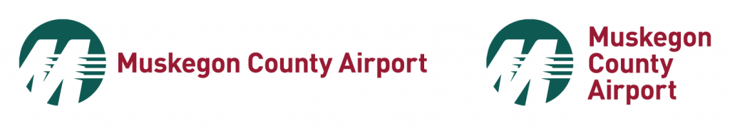

Our hometown airport is a great example of a logo that has a separate symbol and type with different lockups to fit different spaces.
Some logos incorporate the type into the symbol, inextricably combining the two for a complete, single-piece logo that’s used in all applications.
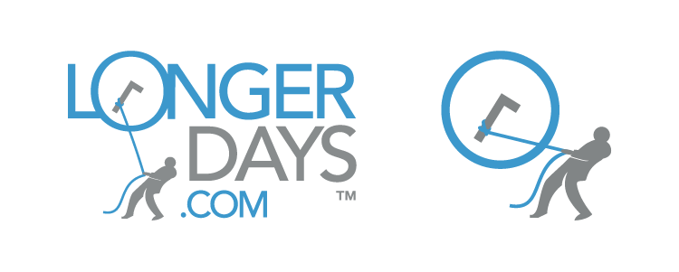

LongerDays’ logo can be considered an integrated, single-piece logo where the type is integrated with the symbolism. It only exists in the proportion seen above. We also have a secondary logo consisting of just the person silhouette and the clock that we use for social media icons, bookmark icons, etc.
Lastly, some logos are type only, applying subtle alterations to certain characters or using custom-designed typefaces to create a logo that’s more unique than simple, typed-out words.
Whichever design and format you choose for your logo, once it has been created, you can look at the rest of the visual elements that will compose your brand.
Colors and Other Elements
Along with your logo, you should adopt a specific color scheme to use in all of your business materials. Typically, these will be the same colors you use in your logo, but you might also want some additional accent colors to make your materials stand out.

LongerDays uses the blue and gray from our logo as our branding color scheme for much of promotional material.
It’s also a good idea to have some other consistent visual elements that you can incorporate into the design of your marketing materials. These can be as simple as consistent geometric shapes, or as elaborate as photo-textures or detailed line art.
Whatever elements you adopt, they should be applied consistently across your different marketing materials. Many businesses will create a “branding manual” that outlines the dos and don’ts of the various visual elements of their brand – but for your business, such an elaborate manual might be overkill. What matters most is that whatever additional visual elements you use are applied consistently across platforms and materials.
Fonts
Having a specific palette of fonts for your marketing materials is an important part of having a strong brand image. Typically, you don’t want to use more than two or three different font families in your branding, and they should compliment the typefaces used on your logo.
The font you use for the body copy should be clear and easy to read, and come in a full range of styles and weights (e.g. bold, italic, thin, ultra bold, etc.). You’ll want to avoid the super common and generic fonts such as Arial, Helvetica, and Times New Roman, but there are plenty of other professional-grade font families available.

Your secondary font can be used as an accent piece – say, for headings or other more decorative elements – but it should compliment both the body copy and your logo itself.
It’s terribly important to use fonts that you have the proper license for. Many professional fonts are licensed just like computer software, which means you have to purchase them to use commercially.
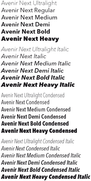
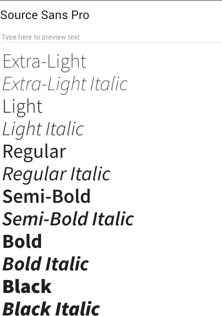
On the left is Source Sans Pro, an open-source font from Google that we use on our website; on the right is Avenir Next, a licensed font that we purchased and use for the LongerDays logo.
However, there are also a lot of professional quality, open source fonts available for free (from repositories such as Google Fonts), allowing you to develop a professional quality brand without spending a bunch of money.
Website
Once you have all of the visual elements of your brand figured out, having a quality website is probably the second most crucially important aspect of building a reputable brand image.
With services like WordPress, Squarespace, and Wix, it’s incredibly easy to put together a quality, professional looking website without ever having to hire a web developer.
Out of those three services, WordPress is probably the most versatile – and the one we use with almost all of our clients. With WordPress, you can choose and install a premade theme that already contains the nuts and bolts necessary to look good on both desktop and mobile devices, meaning that all you need to do is add your logo and change up some colors/fonts to fit your brand.
There are thousands upon thousands of WordPress themes, available both for free or for purchase, that are premade for a variety of purposes – from personal blogging to e-commerce. So, it’s not too difficult to find a theme that’s just right for your business (and the services that you offer).
There’s also an endless array of plugins to add various features and functions, from creating members’ areas to setting up the functions necessary to operate an online store – again without having to hire a web developer.
However, while WordPress can be very easy to use, it’s not foolproof for avoiding sloppy design.
Just like with designing a logo or creating printed materials, it’s important to make sure that the pages of your website are organized and laid out in a clean, consistent, easy to read, and professional manner.
This means making sure that your font size is easily readable and proportioned appropriately to the rest of the content on your page.
This also means making effective use of white space and padding around different elements so your website doesn’t appear crowded. White space around your type is just as important, if not more so, than type size for readability.
You don’t want a website that uses a bunch of clashing colors or dated fonts – imagine an Angelfire website from 1997…. And you want to make sure your site can adjust its layout and scale itself appropriately for mobile phones and tablets. The Big Ugly Website is a website deliberately designed to illustrate what not to do when designing a website.
Your website should be designed to modern standards, using modern typefaces and images that convey the appearance of a well-established, reliable business.
Just like with your logo, having a properly designed website that’s easy to update and maintain will do a great deal for conveying the image of a reliable business that customers want to trust.
What to Do Next?
Now that you know the most important things you need to have a professional brand image, it’s time to find a designer who can help you.
Freelance websites like Upwork and Fiverr can help you find a person with the skillset you’re looking for at a budget you can afford.
However, cost isn’t everything… The phrase “you get what you pay for” is just as true with graphic design as it is with any other product or service.
If you’re prospecting a designer to work on your project, it’s important to review their portfolio of work. If their previous work doesn’t fit the vibe of what you’re looking for, they’re probably not going to be a great fit for your project – even if they match your budget.
It’s just as important, if not more so, to find a designer who communicates well and can help you brainstorm to realize your vision. Every graphic designer has a different skillset and a different approach to their work.
Finding someone who not only fits your budget but is also a good fit for you to work with, is the best possible option. With this ideal scenario, you may be able to develop an ongoing working relationship and hire that person for additional work down the road.
Don’t underestimate the importance of developing a recognizable and high quality brand, and use some of this advice to make informed decisions, develop ideas, and hire the best designers for your needs!
Want to learn more?
[su_button url=”https://longerdays.com/2018/01/01/take-a-tour-of-our-features/” target=”blank” style=”flat” background=”#2F6690″ size=”10″ center=”yes” radius=”6″]Take a tour of our features![/su_button]